Wednesday, October 31, 2012

Hurricane Sandy


Because the majority of my family lives in Maryland, I have decided to write about Hurricane Sandy.  This hurricane is just now beginning to weaken over the interior Northeast, however gusty winds, snow and rain will linger into Wednesday (October 31st, 2012).  On Tuesday morning, a peak total of 8 million people were without power due to this hurricane.  What is even more astonishing is that damage estimates suggest that Sandy caused at least $10 billion in damage!  As of late Tuesday evening, the total number of fatalities blamed on Sandy is 45 in the mainland United States and one in Puerto Rico.  Many of the victims were killed by falling trees.

 These two pictures were taken in Ocean City, Maryland, a beautiful beach/boardwalk that me and my family visit every summer.  Needless to say, it has taken an immense amount of damage.  Fortunately, all of my relatives are safe and only experienced minor power outages.  
This image portrays Hurricane Sandy when it was in full force slamming into the east coast of the United States.  


As the title says, this link visually walks us through the development of this deadly storm.


Homemade Barometer

A barometer, according to Wikipedia, is a scientific instrument used to measure atmospheric pressure. At sea level, the atmospheric pressure will be 1 atmosphere or 760 mmHg (millimeters of Mercury).  The photo below displays our attempt to build a homemade barometer.  Unfortunately, our experiment failed because the balloon would not stay sealed around the glass bowl.  


Interested in creating your own barometer?  Here is tutorial for another way to construct your own!

Monday, October 29, 2012

Sun Trajectory


This graph shows the real movement of the sun throughout the course of the day in Macon, GA on October 29, 2012.  


This graph is what I observed and is obviously not as accurate.  It is very difficult to accurately observe by just looking upwards.


Also, here is some current data for October 29, 2012 in Macon, GA.
  

Sunday, October 21, 2012

Longitudinal Differences


These blue pins represent 5 large cities that span the the globe and are more-or-less in the same longitudinal area.  Kampala, Uganda is the midpoint and sits about 1 degree above the Equator.  All of the times displayed are in East Africa Time.  

Sunrise and Sunset Times for each city:

Stockholm, Sweden:  Sunrise- 6:35 A.M.  Sunset- 10:01 P.M.

Budapest, Hungary:  Sunrise- 6:08 A.M.  Sunset- 8:01 P.M.

Khartoum, Sudan:  Sunrise- 6:42 A.M.  Sunset- 8:07 P.M.

Kampala, Uganda:  Sunrise- 6:31 A.M.  Sunset- 7:43 P.M.

Maputo, Mozambique:  Sunrise- 4:10 A.M.  Sunset- 5:01 P.M.  


High and Low Temperature (F) for each city on October 18, 2012:

Stockholm, Sweden: High- 52  Low- 48

Budapest, HungaryHigh- 66  Low- 45

Khartoum, SudanHigh- 104  Low- 83

Kampala, UgandaHigh- 82  Low- 68

Maputo, MozambiqueHigh- 95  Low- 69

Thursday, October 18, 2012

Wind Rose

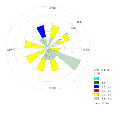
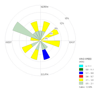
The following wind rose plot displays the wind speed and direction (blowing from) on my birthday, September 6th, 1991.  


The following wind rose plot displays the wind speed and direction (blowing to) on my birthday, September 6th, 1991.  


The following wind rose plot displays the wind speed and direction (blowing from) throughout the entire month of September in 1991.


This is a Google Earth image of the Atlanta Airport, which contains a weather monitoring system.


Monday, September 3, 2012

Maps


Choropleth maps use shading to display information, making it easy to visualize the data.  This map, made in 2000, shows the percentage of Baptist residents living in the United States.  Clearly, the "Bible belt" is not a made-up phrase; the majority of Baptists are located in the southeast region of the U.S.  Besides the missing North marker, this map was well made with a clear title, color distinction, a scale, and a valid source.


As the name implies, a dot density map uses a dot symbol to portray information.  The map has each dot representing 200 poor persons living in a nonmetro county.  This form of labeling helps to visualize what areas of the U.S. have the greatest density of "nonmetro poor."  Unfortunately, this 2004 map does not have a scale or a North marker.

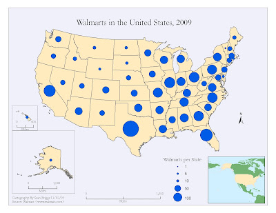
Proportional symbol maps use symbols (in this case, circles) of different sizes to represent data.  The above map, made in 2009, gives us information about one of the most important stores in this country: Walmart.  Each circle matches the key and tells us the number of Walmarts per state, based on the size of the circle.


An environmental sensitivity map gives a summary of coastal resources that may be at risk in the case of an oil spill.  Examples of these resources that are at risk include: biological resources, sensitive shorelines, and human resources ("Environmental Sensitivity Index (ESI) Maps.").  This map gives a visual aid for these at-risk resources in Hawaii.  However, this map contains a large flaw: it does not tell us when it was made so we do not know how current the data is.


The final map that we will be looking at is an isopleth map.  This type of map uses lines or colors to portray areas that have similar regional aspects.  In the above map, the lines represent mean annual precipitation, in inches.  Although it may be difficult to see, each line has a small number that indicates the mean annual precipitation within that area.  


Sources Used:

"Environmental Sensitivity Index (ESI) Maps."Environmental Sensitivity Index (ESI) Maps | Response.restoration.noaa.gov. National Oceanic and Atmospheric Administration, 31 Aug. 2012. Web. 03 Sept. 2012. <http://response.restoration.noaa.gov/esi>.